
The Perfect Homepage: A Fractional CMO’s Guide to Converting Visitors
Look, I’ve audited hundreds of homepages over my career, and most of them make the same fatal mistake: they’re built for the business owner, not the customer.
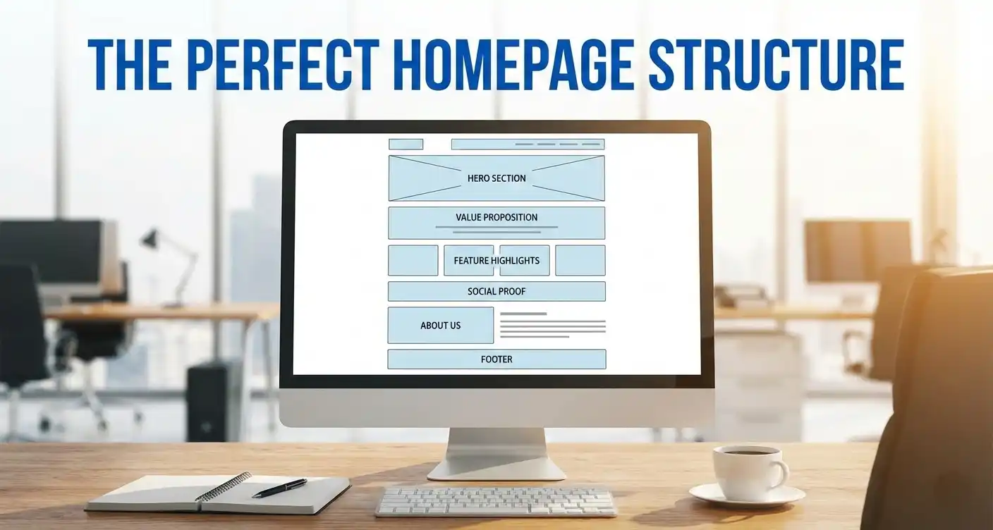
Your homepage isn’t a digital brochure. It’s a sales tool. Every element needs to work together to guide your visitor toward one goal—taking action. Whether that’s booking a consultation, making a purchase, or signing up for your service, the structure matters more than you think.
I spent years in adtech working with companies like Netflix, MetLife, eBay, and Verizon, optimizing their landing pages and advertising across different ad types. I’ve seen how these elements affect conversions firsthand. I’ve seen the data that most clients never get to see—the real numbers behind what works and what doesn’t. After building and optimizing hundreds of homepages for startups and SMBs, I’ve landed on a proven structure that converts.
This isn’t theory—it’s battle-tested across industries. Let me walk you through it.
Hero Section
This is the very top of your homepage, and you’ve got about 5 seconds to grab attention. If you lose them here, they’re gone. Your hero section needs to include:
Eyebrow Copy – A short line that directly addresses and calls out your ideal clients. Think of it as your “this is for you” moment. It’s that small bit of text that sits above your main headline to provide instant context.
Headline – This is your promise. It needs to solve your client’s problem or fulfill their desire. Focus on the emotional outcome they want, not just what you do. “We design kitchens” is boring. “Love coming home to a kitchen that makes you smile” hits differently.
Sub-headline – Here’s where you explain how you’ll deliver on that promise. If you’re a local business, include your location so people know you serve their area.
Call to Action Button – Be specific. “Book your free design consultation” converts way better than “Contact Us.” Tell them exactly what happens next.
Social Proof – Trust is everything. Add customer photos, testimonial snippets, or a 5-star rating graphic right here in the hero. It builds immediate credibility.
Hero Image – Show the happy “after” result your clients experience, not the “during” process or photos of your business. People buy outcomes, not processes.
Three Checkmarks/Outcomes
Right below your hero, list three short, punchy outcomes your client will achieve by working with you. Keep these benefit-focused. For example: “Beautiful new kitchen,” “Higher home value,” “Stress-free renovation.”
Problem Section
Now that you’ve got their attention, agitate the pain. Clearly state the main problem your ideal client is facing and bring up the symptoms and frustrations they’re experiencing. This shows you understand their world. You’re not just selling—you’re empathizing.
Solution/Mentor Section
This is where you position your service as the solution. Establish that you deeply understand their challenges and are uniquely qualified to help them. Add a professional photo of yourself or your team here. People do business with people, not faceless companies. Build that personal connection.
Benefit Section
Highlight three main benefits customers can expect that differentiate you from competitors. Remember: benefits are what the customer actually gets and experiences, not just features. “24/7 customer support” is a feature. “Never worry about being left in the dark” is a benefit.
Testimonials
Include three short, specific testimonials that overcome common objections, address key pain points, or highlight positive outcomes and transformations. Always use customer photos and 5-star graphics when possible. Real faces build real trust.
Here’s something I learned in adtech: social proof at this point in the page dramatically reduces bounce rates. When people see others like them getting results, they stick around.
Three-Step Section
Make it stupid simple. Show how easy it is to work with you in three clear steps:
Step 1 – What the client does (e.g., “Book your free consultation”)
Step 2 – Your simplified process (e.g., “We design your perfect space”)
Step 3 – The client’s happy outcome (e.g., “Enjoy your beautiful new kitchen”)
People want to know the path forward. Show them it’s easy.
What Sets You Apart
This is where you showcase what makes you different from competitors. You’ve got two options here:
10 Reasons Why List – A compelling checklist of specific reasons to choose your business over competitors. Make each one count.
Comparison Chart – A side-by-side comparison of your service versus “the other guys.” Visually highlight your distinct advantages. This works especially well if you’re disrupting an industry.
From my years working with major brands on their advertising, I can tell you that differentiation at this stage is critical. By now, your visitor is convinced they need a solution—they’re just deciding if it’s you or someone else.
Features Section
Now we get tactical. Provide a straightforward list of features or “tech specs” for the more analytical visitors who need logical justification to support their emotional buying decision. They’ve already been sold emotionally—now you’re just giving them the ammunition to justify it logically.
Frequently Asked Questions (FAQ)
Proactively answer common questions and address potential objections before they become barriers. This section acts as a virtual salesperson, removing doubt and hesitation. Think about what people ask you on sales calls and answer it here.
Final Call to Action
End with a simple, specific call to action that repeats your main CTA from the hero section. Tie it directly to your client’s dream outcome to reinforce the transformation you’re offering. “Ready to fall in love with your home again? Book your free consultation today.”
Here’s the truth: most businesses overcomplicate their homepage because they’re trying to say everything. The best homepages say one thing really well—and then they say it again in different ways throughout the page.
This structure works because it follows the way humans make buying decisions. We lead with emotion, justify with logic, and then need a little push to take action. Your homepage should mirror that journey.
From all my years working with Netflix, eBay, Verizon, and MetLife on landing page optimization, plus hundreds of homepages for startups and SMBs, I’ve seen what converts and what doesn’t. The data doesn’t lie. This structure consistently outperforms everything else because it respects how people actually browse, decide, and buy.
If your current homepage isn’t converting the way you want, run it through this framework. I promise you’ll find gaps. And if you need help building a homepage that actually drives results? That’s exactly what I do as a Fractional CMO—diving deep into your brand and helping you create the strategy, messaging, and structure that gets results.
Let’s make your homepage something your competitors wish they had.

